Curriculum Advances
Lead Product & UX/UI Designer
Curriculum Advances is a digital courseware platform for MBA programs, piloted at London Business School, Oxford, Cambridge, and NYU. Students work through structured lessons, activities, and assessments across subjects from statistics to AI. I led product design from discovery through a 6-month MVP delivery.
- Problem & Opportunity
- Leading business schools, including London Business School, Oxford, Cambridge, and NYU, needed a flexible way to deliver foundational and skills-based MBA courseware without overloading in-person teaching time. The platform had to support diverse subjects, integrate with institutional systems, and remain engaging for students learning independently and often on the move.
- My Responsibilities
-
- Foundation phase: competitive analysis (Coursera, Brilliant), user research, persona definition, product strategy with the Product Lead
- Designed interactive course frameworks supporting diverse content types (from quantitative modules to AI learning)
- E2E user journeys for students and instructors, focused on keeping interactions calm and intuitive
- Dual-track delivery: scope discovery and usability testing ran ahead of development sprints
- Built high-fidelity prototypes, design system, and visual language in Figma across a 6-month MVP delivery
- Design Solutions
-
- Modular course structure supporting lessons, activities, revision, and assessment
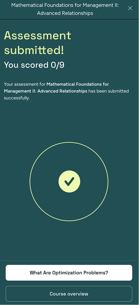
- Clear progress indicators at lesson, topic, and course levels
- Non-linear navigation enabling concept review and reference
- Device-agnostic UI supporting mobile, tablet, and desktop usage
- Scalable framework adaptable to multiple subject domains
- Outcomes
-
- Piloted at London Business School, Oxford, Cambridge, and NYU
- Debuted at the AMBA Conference (Association of MBAs)
- Delivered a production-ready MVP within a 6-month timeline
- Reusable framework supports multiple courses and subjects without redesign
- Key Takeaways
-
- Real learning behavior is non-linear. Rigid progression fights how students actually study.
- Progress feedback and pacing matter more than content density for keeping students engaged.
- The platform architecture has to serve both instructional goals and system scalability.
Learning Experience & Interaction Design
We studied Coursera, Brilliant, and similar platforms early on. The pattern was clear: most get activity sizing wrong. Too dense and students disengage. Too short and nothing sticks. We designed each lesson as a sequence of focused interactions that built on each other without overwhelming the student.
The hardest part wasn't designing interactions. It was right-sizing them. Too much information and students check out. Too little and the concept doesn't land.
Progress feedback turned out to be critical for motivation. The platform shows advancement at both the lesson and course level through visual cues, sound, and motion. Students often learn in short bursts between other things, so we built pause-and-resume into every interaction.
We designed around real study behavior: short sessions, multiple devices, and the freedom to pause, resume, and revisit at any point.
Navigation is non-linear. Students can jump back to any completed concept to review or reference it. The whole experience works across mobile, tablet, and desktop.
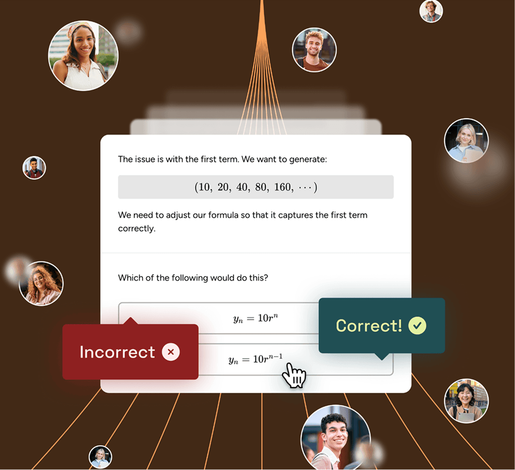
Error handling needed care. When a student gets an answer wrong, the feedback has to guide without discouraging. We tested different approaches and landed on explanations that reinforce the concept rather than just flagging the mistake.
The underlying framework is subject-agnostic. It supports everything from statistics to MBA prep to personal development without redesigning the core experience.
'%3e%3cpath%20d='M1022.33%200H.334v890h1022v-890z'%20fill='%233E3357'/%3e%3cpath%20d='M820.287%20445.5c0%20347.663-138.1%20629.5-308.455%20629.5-170.355%200-308.455-281.837-308.455-629.5%200-347.663%20138.1-629.5%20308.455-629.5%20170.355%200%20308.455%20281.837%20308.455%20629.5z'%20stroke='%23C5B1F2'%20stroke-width='2'%20stroke-linejoin='round'/%3e%3cpath%20d='M357.603%20748.637C56.518%20574.806-118.51%20314.289-33.332%20166.757c85.178-147.531%20398.305-126.211%20699.39%2047.621%20301.086%20173.831%20476.113%20434.348%20390.935%20581.879-85.174%20147.535-398.301%20126.212-699.39-47.62z'%20stroke='%23C5B1F2'%20stroke-width='2'%20stroke-linejoin='round'/%3e%3cpath%20d='M666.058%20709.419C364.973%20860.799%2051.845%20879.368-33.332%20750.888c-85.178-128.476%2056.518-355.345%20357.603-506.724%20301.086-151.38%20614.213-169.946%20699.391-41.469%2085.174%20128.477-967.144%20558.04-666.058%20709.419z'%20stroke='%23C5B1F2'%20stroke-width='2'%20stroke-linejoin='round'/%3e%3cpath%20d='M434.219%20357.309H353.334v114.353h158V357.309h-77.115zm-80.885%20237.663h316v-123.308h-158V471.662h-158v123.31z'%20fill='%23312944'/%3e%3cpath%20d='M353.334%20357.309h316M353.334%20357.309v114.353M353.334%20357.309h80.885M669.334%20357.309v114.353M669.334%20357.309h-80.2M353.334%20471.662v123.308h316V471.662M353.334%20471.662h158M434.219%20357.309c0-33.86%2034.679-61.309%2077.458-61.309%2042.778%200%2077.457%2027.449%2077.457%2061.309M434.219%20357.309h155M669.334%20471.662H511.334M511.334%20471.662v33.41'%20stroke='%23C5B1F2'%20stroke-width='2'%20stroke-linejoin='round'/%3e%3c/g%3e%3cdefs%3e%3cclipPath%20id='clip0'%3e%3crect%20width='1022'%20height='889.556'%20fill='white'/%3e%3c/clipPath%3e%3c/defs%3e%3c/svg%3e)

'%3e%3cg%20clip-path='url(%23clip1)'%3e%3cmask%20id='mask0'%20style='mask-type:luminance'%20maskUnits='userSpaceOnUse'%20x='-636'%20y='0'%20width='1273'%20height='1273'%3e%3cpath%20d='M636.333.445H-635.667v1272h1272v-1272z'%20fill='white'/%3e%3c/mask%3e%3cg%20mask='url(%23mask0)'%3e%3cpath%20d='M636.747%201H-635.253v1272h1272V1z'%20fill='%23204F54'/%3e%3cpath%20d='M-635.667%20706.555h1273.245M-635.667%20140.672h1273.245M-635.667%20848.035h1273.245M-635.667%20282.145h1273.245M354.641-.801v1273.241M-635.667%20989.504h1273.245M-635.667%20423.613h1273.245M213.143-.801v1273.241M-635.667%201130.98h1273.245M-635.667%20565.094h1273.245M71.665-.801v1273.241'%20stroke='%23E3F1A1'%20stroke-width='2'%20stroke-linejoin='round'/%3e%3cpath%20d='M55.097%201104.42L339.816%201041.48l29.426-133.122-118.084-118.085-133.127%2029.427-62.935%20284.718L202.672%20956.506c-13.382-13.382-13.382-35.08%200-48.463%2013.384-13.382%2035.081-13.382%2051.463%200%2013.384%2013.382%2013.384%2035.08%200%2048.463-13.383%2013.383-35.08%2013.383-51.463%200L55.097%201104.42z'%20fill='%2317383C'/%3e%3cpath%20d='M251.157%20790.273L369.242%20908.358l15.165%2015.167L469.554%20838.378L321.137%20689.961l-85.147%2085.147%2015.167%2015.165z'%20fill='%2317383C'/%3e%3cpath%20d='M55.097%201104.42L339.816%201041.48l29.426-133.122M55.097%201104.42l62.934-284.72%2096.127-29.427M55.097%201104.42l147.575-147.914M369.242%20908.358l-118.084-118.085M369.242%20908.358l15.166%2015.167M251.158%20790.273l-15.167-15.165M202.672%20956.506c13.384%2013.383%2035.081%2013.383%2051.463%200%2013.384-13.382%2013.384-35.08%200-48.463-13.382-13.382-35.08-13.382-51.463%200-13.382%2013.382-13.382%2035.081%200%2048.463ZM235.991%20775.108l148.417%20148.417M235.991%20775.108l85.147-85.147%20148.417%20148.417-85.147%2085.147'%20stroke='%23E3F1A1'%20stroke-width='2'%20stroke-linejoin='round'/%3e%3cpath%20d='M250.978%20790.356L369.16%20908.537l15.178%2015.178L469.553%20838.5L321.015%20689.961l-85.216%2085.215%2015.179%2015.18z'%20fill='%2317383C'%20stroke='%23E3F1A1'%20stroke-width='2'%20stroke-linejoin='round'/%3e%3cpath%20d='M-359.361%20551.809c207.229%200%20207.229%20552.611%20414.457%20552.611'%20stroke='%23E3F1A1'%20stroke-width='2'%20stroke-linecap='square'%20stroke-linejoin='round'%20stroke-dasharray='20%2020'/%3e%3cpath%20d='M70.032%201104.42c0-8.25-6.688-14.94-14.936-14.94-8.248%200-14.935%206.69-14.935%2014.94s6.687%2014.94%2014.935%2014.94c8.248%200%2014.936-6.69%2014.936-14.94z'%20fill='%23E3F1A1'%20stroke='%23E3F1A1'%20stroke-width='2'%20stroke-linecap='square'%20stroke-linejoin='round'/%3e%3c/g%3e%3c/g%3e%3c/g%3e%3cdefs%3e%3cclipPath%20id='clip0'%3e%3crect%20width='469.333'%20height='1272'%20fill='white'/%3e%3c/clipPath%3e%3cclipPath%20id='clip1'%3e%3crect%20width='1272'%20height='1272'%20fill='white'%20transform='translate(-635.667%20.445)'/%3e%3c/clipPath%3e%3c/defs%3e%3c/svg%3e)