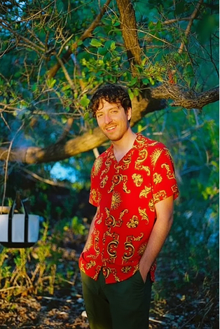
JAKUB KOHOUT
EXPERIENCE
FEATURED PROJECTS
About Me
I grew up in a tiny village in Czech Republic. 80 people. Got into computers through gaming, started making After Effects videos for my Call of Duty clan at 14, and my brother showed me HTML/CSS a year later. I designed and coded my first website at 15 and never stopped.
At 18 I started as a frontend engineer at agencies in Czech Republic, coding and designing WordPress sites for about four years. Then I moved to New York and built a collaborative academic writing tool at NYU: formatting, commenting, and media management for students across partner schools.
After NYU I joined SmartGift as the second employee. Over three years I designed the core product and co-invented a patented gifting flow that scaled from one small client to 500+ brands across 14 countries. Nike, Under Armour, Pandora, Estée Lauder, Brilliant Earth. Over a million users a year. The company was acquired by 1-800-Flowers.
After the acquisition I moved back to Europe and spent a few years as a senior designer at U+ and Oak's Lab. Fast-paced product work across edtech, maritime procurement, and brand systems.
Now I'm bringing both halves back together. I started as an engineer, went deep on design, and tools like Claude Code and Cursor have made it possible to operate across both. Design engineer is the role I've been building toward my whole career. I just didn't have a name for it until recently.
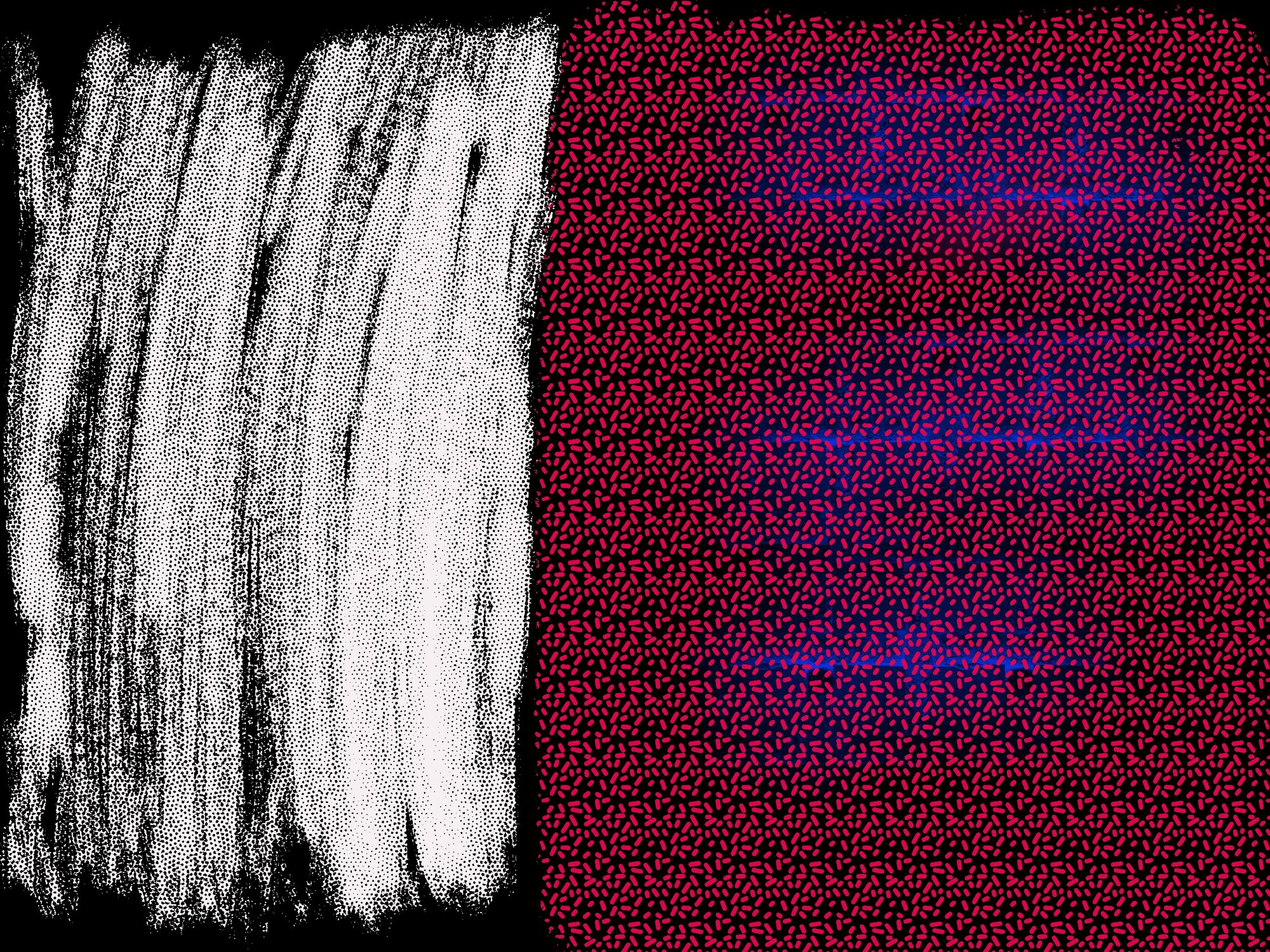
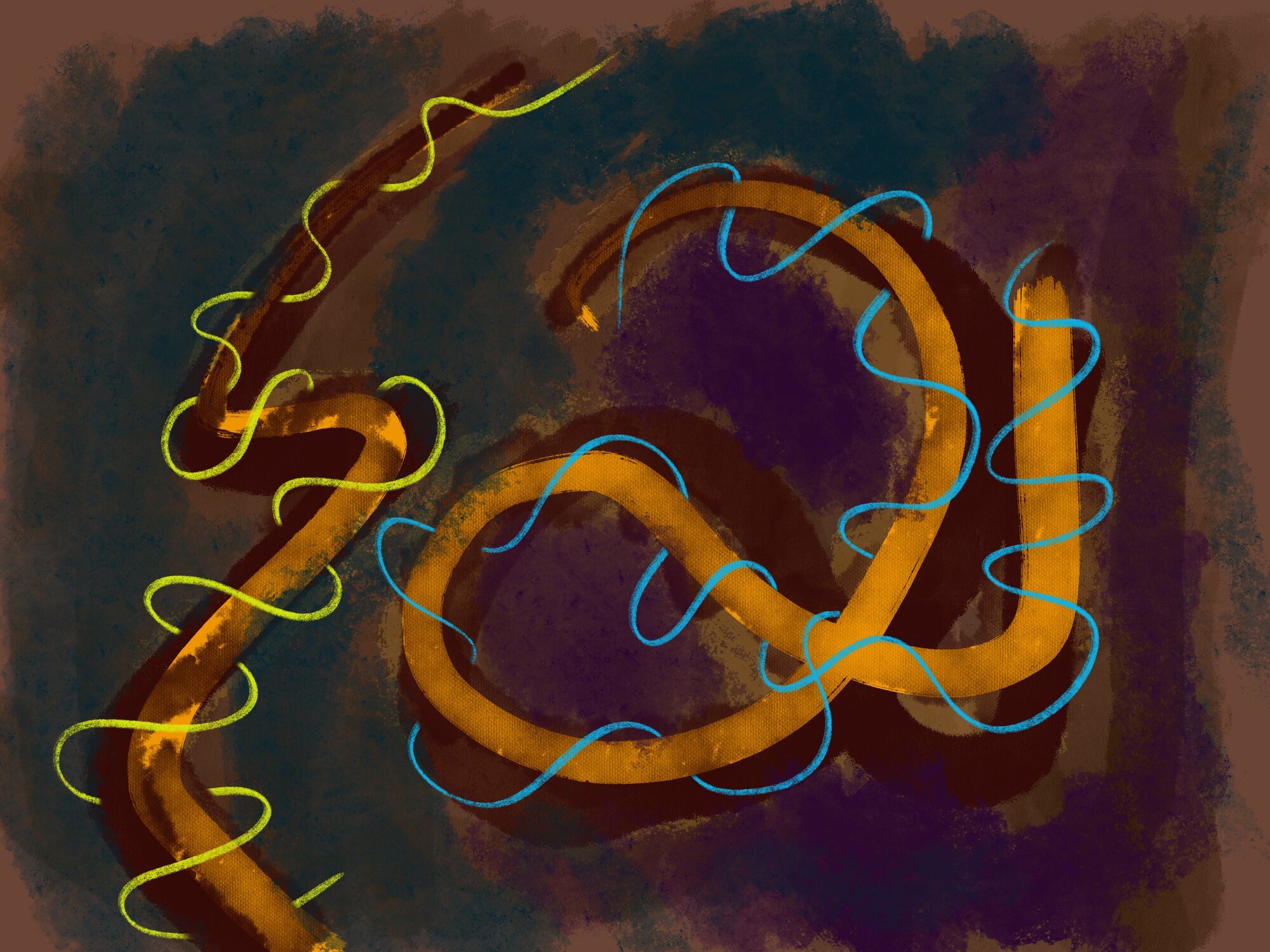
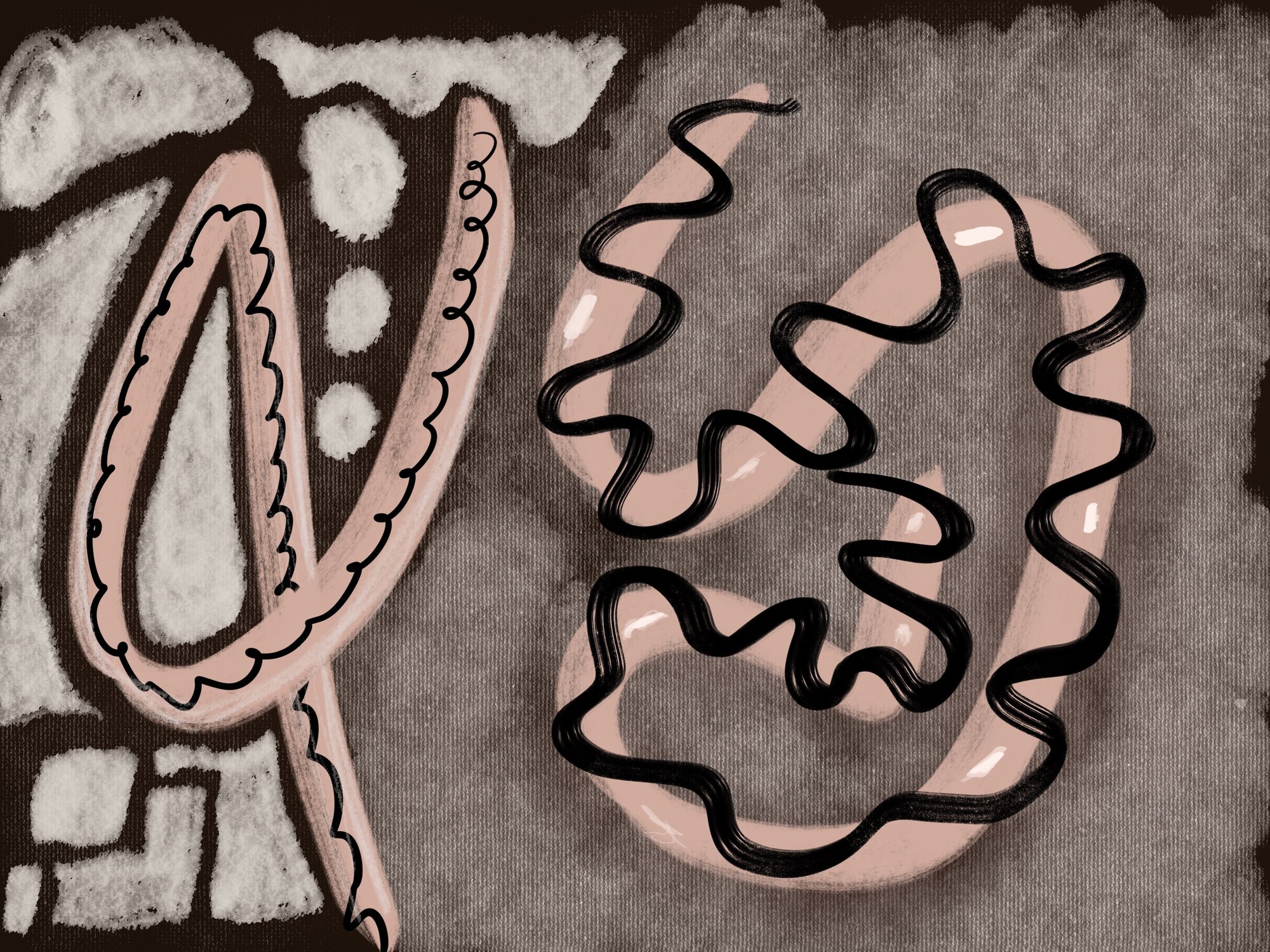
Digital Paintings
Abstract compositions and color studies created in Procreate. Separate from design work, just for the practice.
View Gallery

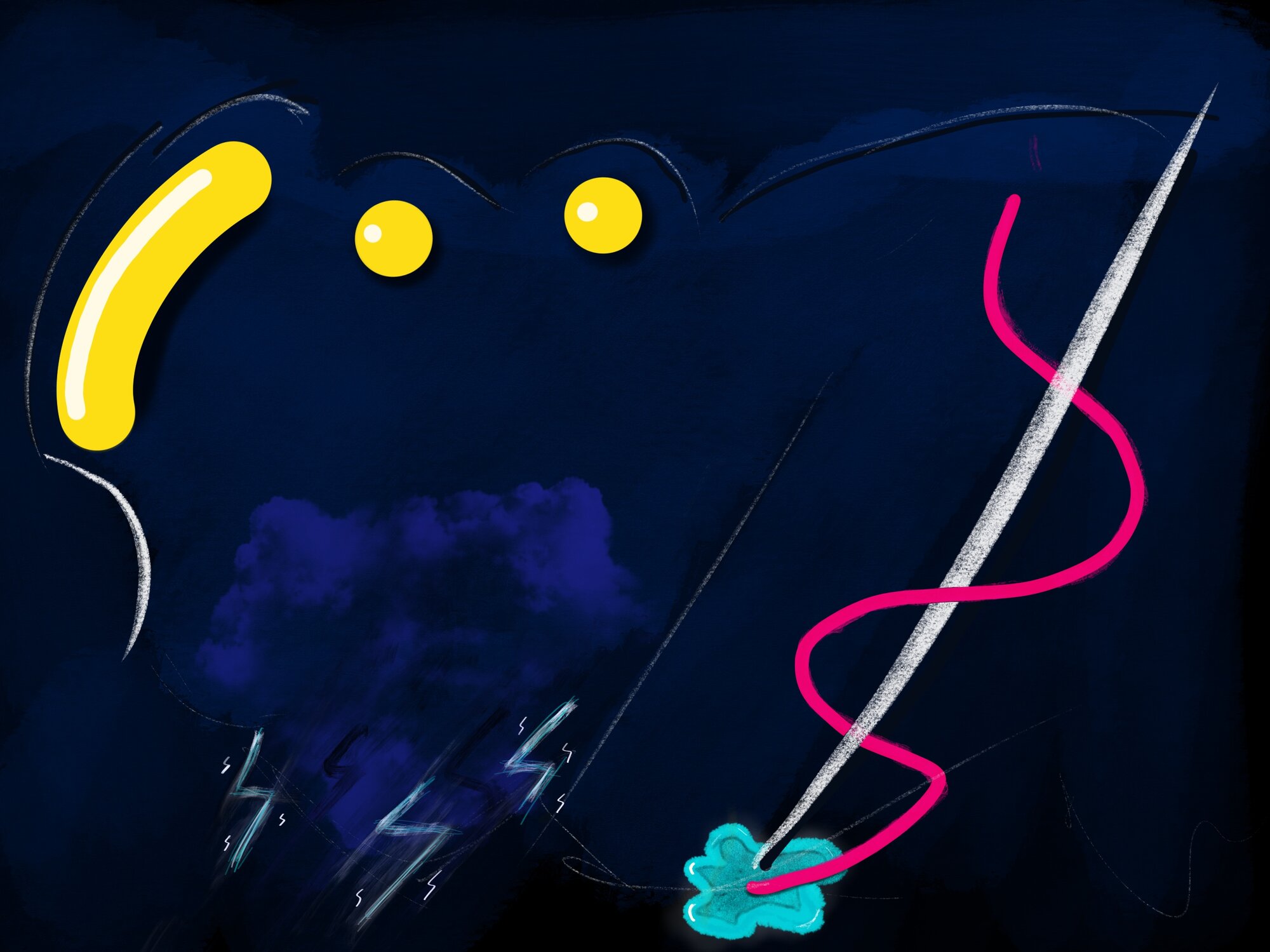

Sometimes I Paint
Digital explorations and abstract compositions